Job Opening
Time: 4 weeks
Scope: UX/UI
Job Openings
Our b2b product, Teamwork Pro provides personality data to recruiters and hiring managers and allows them to see how candidates would fit into a team.
The ”Job Openings” feature helps recruiters narrow down their shortlist of candidates by understanding their soft skills and how they would fit into the team. Once candidates are invited by a recruiter, they take the Good&Co personality quizzes and their data populates into the Job Opening.
Brief
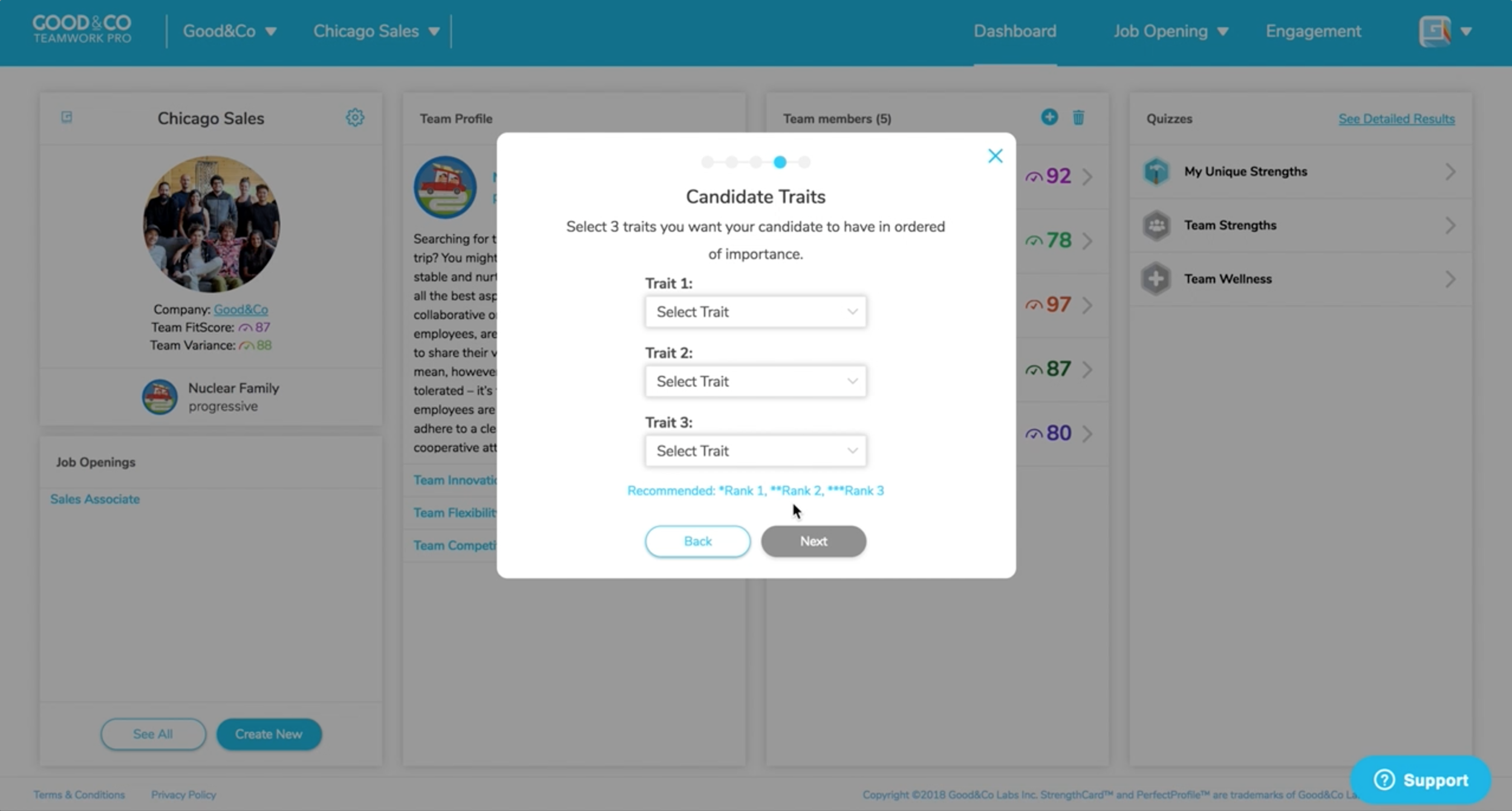
To create a Job Opening users have to go through a long flow (including 15 clicks) of modal windows with little sense of when the task will be complete.
The original brief for this project was to add another step into this flow as we were launching a new feature, “Ideal Profile”. Ideal Profile is a free version of a paid feature, “PerfectProfile” which is a custom personality profile based on a manager’s top performers. An Ideal Profile is a personality template that a user could match to candidates personality profiles to determine if their personality was suitable for the job.
I strongly believed that bloating this already arduous flow was a mistake that would lead to more user pain. After discussing my concerns with the product team we increased the scope to reimagine and simplify the end-to-end experience.
Before


Problems with this Flow
Long series of modal windows (15 clicks)
No sense of what PerfectProfile is or why a user should get one
“Thinking Style” slider interaction requires a lot of thought as it is a sensitive scale with no feedback as to what you have selected
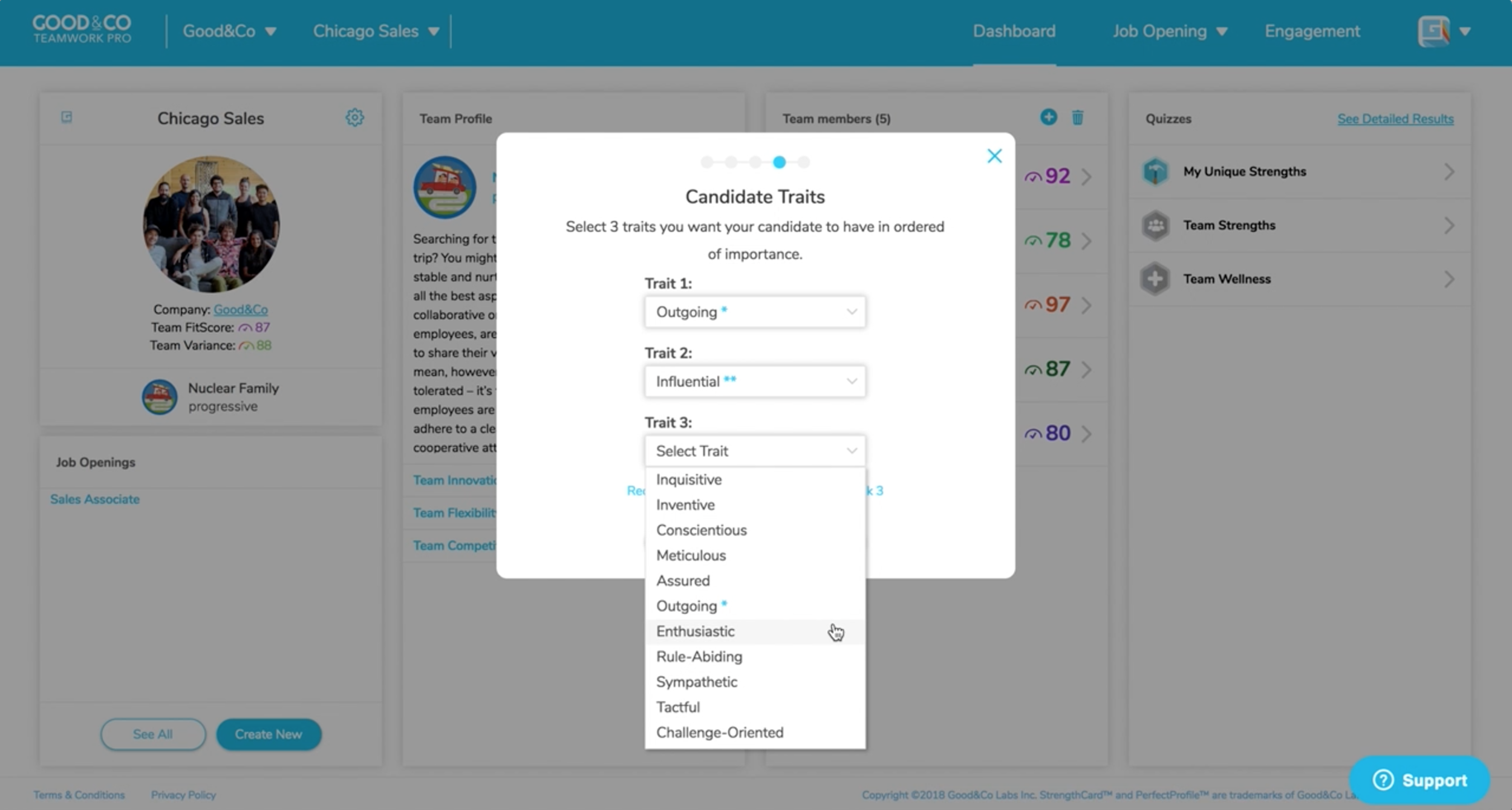
Choosing traits has an old-fashioned ranking system using multiple asterisks to denote importance
When entering email addresses, users had to click “Add” button after each one (hitting “enter” didn’t work) which is not a familiar pattern
Challenges
This flow was not an apples-apples comparison to creating a typical job listing. The questions they need to answer to complete this task are related to the personality science algorithms that create candidate scores to help them make hiring decisions.
After trying to explain this feature to several people if was clear the the name “Ideal Profile” was not distinct enough from our paid feature “PerfectProfile”.
Research
Competitors
I researched job listing flows from AngelList, Lever and ZipRecruiter and noticed that they followed a simple single page pattern that allowed the user to see the entirety of the task ahead of them and gave them the satisfaction of completing the task quickly.
Wireframes
I put together a few wireframes to see if this was a pattern that would work for us. Testing a clickable prototype revealed that there were some problems with the grouping of information, confusion about which steps were optional vs required and questions about the new feature. After learning how this could be improved I created a mid-fi clickable prototype and tested it again.
Solution
Layout: Single page layout with clear labeling for optional steps. Reduced from 15 clicks to 10 clicks.
Personality Profile: ”Ideal Profile” was renamed “Ready-Made Profile” to distinguish it from PerfectProfile which cannot be used instantly. I used tabs to separate the two which indicates that these features are related but puts PerfectProfile in the spotlight (business requirement). A bucketing system divides 47 Ready-Made Profiles into categories.
Thinking Style: Snap to point Likert-scale with 6 options to reduce the infinite choice of a sensitive slider scale.
Traits: As the scope of this project was already increased we were not able to greatly change the drop down menus. Old-fashioned asterisks were removed and that was a win!
Inviting Candidates: Separate page with typical email. “Add” button was removed and users can now hit enter which feels more natural.
Next Steps
For the next evolution we would like to implement a smart search for the ideal profile options as well as a drag and drop interaction for the traits section.


