Teamwork Pro Design System
Time: 4 weeks
Scope: UX/UI

Problem
Our hiring tool, Teamwork Pro had been built quickly by many designers. Once we had time to step back and reevaluate the product, we saw many inconsistencies and an overall lack of precision and beauty. We decided that a redesign was necessary.
The speed at which we first designed this product was also frustrating for our developers who were repeating code and building pages from scratch. They were planning to switch to a Bootstrap framework so the timing was perfect to clear the slate, and develop a design system that could be shared among the design team and coded only once by developers.
Objective
Create a single source of truth for UI elements to be used by design and development.
Process
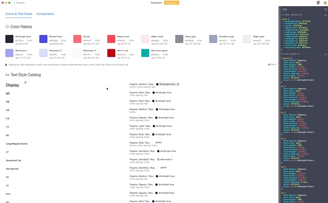
I began by breaking down an important page that was 90% designed. I did an audit of colors, buttons, text, icons, padding to consolidate and repair minor inconsistencies. All elements were broken down using an atomic system. The symbolic use of color was carefully considered. We chose blue for clickable elements, coral to signify which part of the page is active and green for success.
There was certainly a lot of trial, error and debate to complete this project. I tested the system on designers several times to make sure that it was clear, understandable and easy to use for everyone on the team.
Solution
This project started off with a chaotic document filled with artboards, symbols and styles from multiple designers. By the end, our symbol library was organized into a neat and logical list.

We decided to use the Atomic Design methodology to create a Sketch library of nested symbols. Using an atomic system helped to maintain sanity while consolidating many elements. Having everything in a shared library allows all designers on the team to stay up to date with any changes made to the system. All assets within the library are sliced so that designers never have to waste time slicing them before handing off to developers.

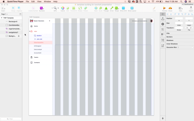
I created a template Sketch file with document-specific design tools such as colors, layer styles, text styles and a starter artboard with basic top and side navigation elements (the building blocks of every page), as well as our bootstrap grid positioned correctly.

The typography guide gives examples of where different type styles are used and shows detailed information about each category.

All atoms, molecules and organisms were uploaded to and organized within the components page of our Zeplin project. This is the shared source of truth for designers and developers.
Outcomes
The team has successfully been using the new system for a few months. Developers were champions of the system and rapidly built their own UI catalog which has accelerated their work flow. As we continue with the redesign, we are finding ways to recycle what exists in the system as much as possible and are discovering and debating when it is necessary to push the boundaries and add a new element.
In summary, the system offers:
Clearer communication
Reduced coding errors
Reduced development time
Improved basis for later system maintenance and modification
Here’s a quick look at how we use symbols to quickly build out pages:
Next Steps
Working on a small design team means that we can easily discuss how we are each contributing to the evolution of this system. As we mature and scale as a team and organization, we will need to develop design principles to inform the rules, boundaries and intentions of how the system should evolve.
More Projects


